Monday, 25 October 2010
Sunday, 24 October 2010
Part 1 — THIS WORLD
Section 1. — Of the Nature of Flatland
Section 2. — Of the Climate and Houses in Flatland
Section 3. — Concerning the Inhabitants of Flatland
Section 4. — Concerning the Women
Section 5. — Of our Methods of Recognizing one another
Section 6. — Of Recognition by Sight
Section 7. — Concerning Irreglular Figures
Section 8. — Of the Ancient Practice of Painting
Section 9. — Of the Universal Colour Bill
Section 10. — Of the Suppression of the Chromatic Sedition
Section 11. — Concerning our Priests
Section 12. — Of the Doctrine of our Priests
PART II — OTHER WORLDS
“O brave new worlds, That have such people in them!”
Section 13. — How I had a Vision of Lineland
Section 14. — How I vainly tried to explain the nature of Flatland
Section 15. — Concerning a Stranger from Spaceland
Section 16. — How the Stranger vainly endeavoured to reveal to me in words the mysteries of Spaceland
Section 17. — How the Sphere, having in vain tried words, resorted to deeds
Section 18. — How I came to Spaceland, and what I saw there
Section 19. — How, though the Sphere shewed me other mysteries of Spaceland, I still desire more; and what came of it
Section 20. — How the Sphere encouraged me in a Vision.
Section 21. — How I tried to teach the Theory of Three Dimensions to my Grandson, and with what success
Section 22. — How I then tried to diffuse the Theory of Three Dimensions by other means, and of the result
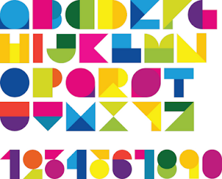
cool pages!
 Source - http://lilfishstudios.blogspot.com/2009/07/abc-book-origami-love.html
Sunday, 17 October 2010
Thursday, 14 October 2010
handmade books....
http://www.instructables.com/id/How-to-bind-your-own-Hardback-Book/
For making my own book i might as well do it properly... or give it my best shot anyway.
this will also allow me to change and modify the process as i see fit to hopefully come up with my own desired outcome. whether or not this is going to be a book primarily for reading, something which can be read or something purely to personify the story is still up in the air and undecided... but hopefully something solid will enter my brain soon!
why i chose the books in the previous post.
brilliantly weird book cover design
 Weird and wonderful book cover design, there are many more of this style shown on the below source website.
Source - http://www.weirdomatic.com/strange-book-covers.html
book
Monday, 11 October 2010


 Sources (respectively)
Sunday, 10 October 2010
cover i liked
Brief me!!
Your task is to produce a proposal for a new edition of Flatland that doesn’t necessarily engage with the conventions of ‘the book’ as we understand them, although it may have text matter, pages and a cover – or not. It could be a pamphlet, a chapbook, a poster, a landscape, a happening, a dream, an installation, a text, a sound piece, an animation, a moment.
Interpret the text typographically – you can be as ambitious as you wish to be, but you must deal with the full contents of at least one chapter and show how the rest of the text would develop.
There are no restrictions, no conventions, no rules, no given formats. Static work, moving image, physical, virtual, ephemeral are all up to
you, as is the navigation of the piece, its viewer/ reader/user engagement, its scale, simplicity, complexity, composition.
What can it become? There is a quote in the film Amadeus that says if you have four people talking at once, then that’s an argument . . . if you have four people singing at once, then that’s Opera.
Make an opera, not an argument!
i liked this brief because it basically leaves it wide open for me to do whatever i wish, for this module it allows me to experiment and take risks. Both these are favoured in the module. Also the subject is interesting and the book is also very interesting and could make for a great piece of work if i do it correctly.


